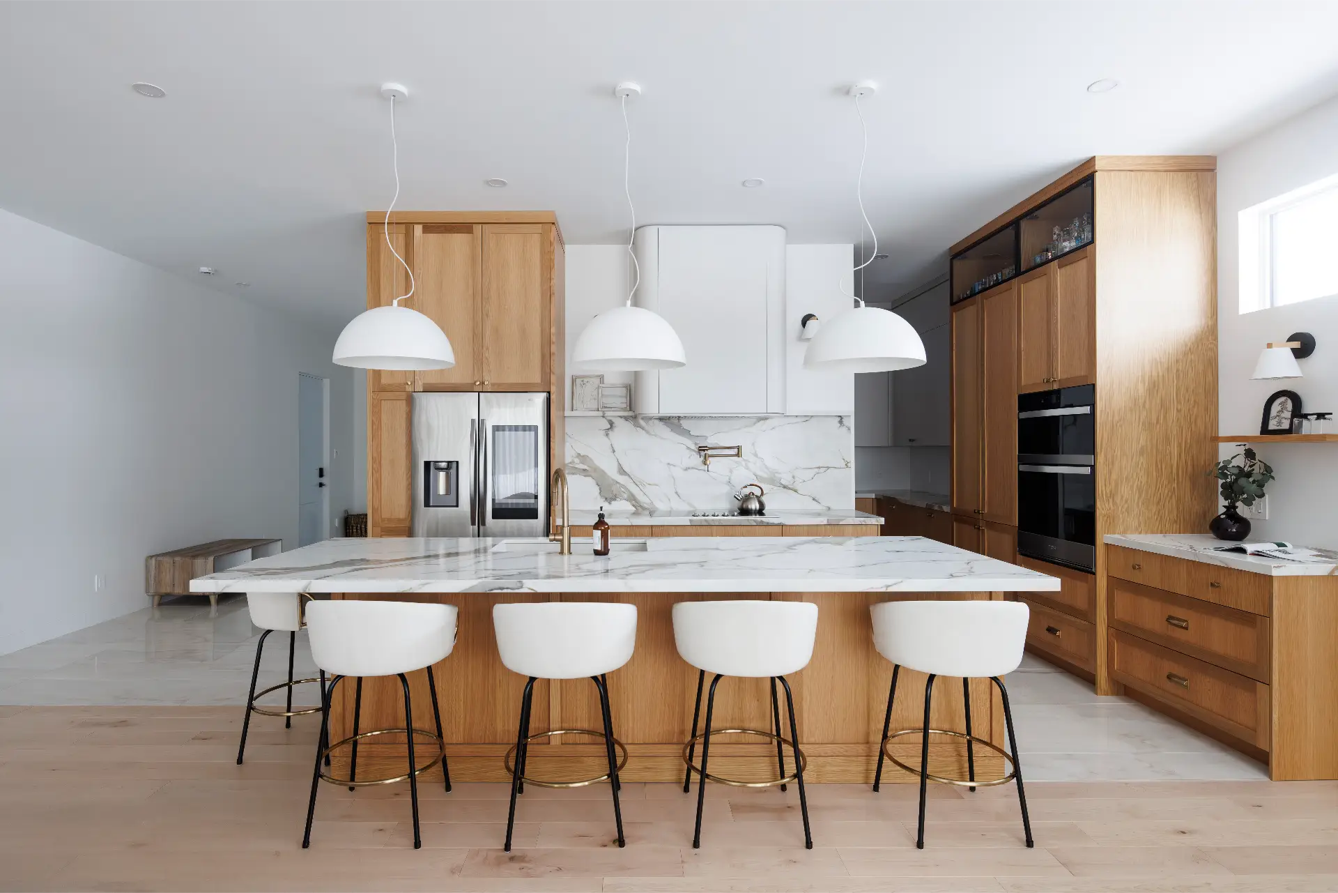
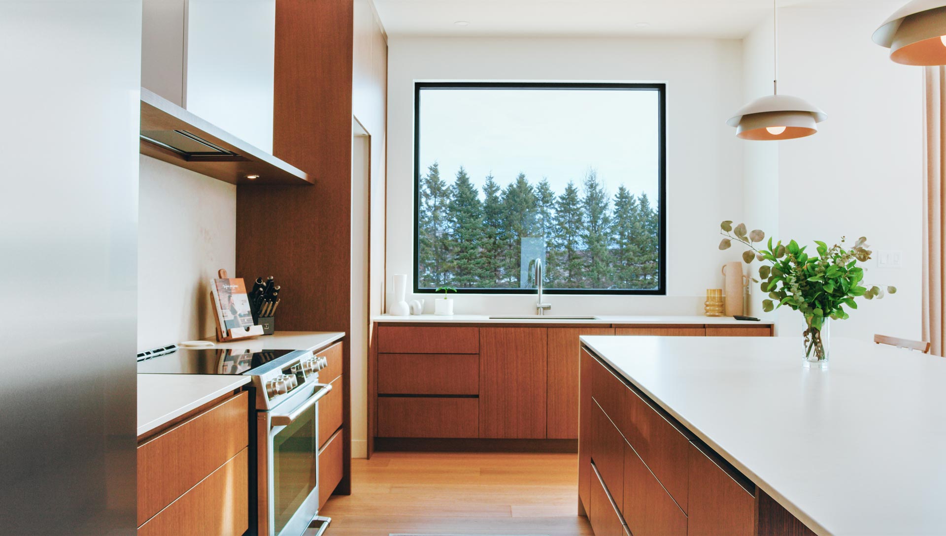
Colour is making a remarkable return in the kitchen. After years dominated by pure white kitchens, warmer palettes are emerging, with kitchen cabinet colours that are more rooted in nature: muted neutrals, terracotta, mossy greens, deep blues and, above all, magnificent wood species being showcased. This evolution is accompanied by matte finishes and organic textures (stone, lime, zellige, brushed wood), creating kitchens that are both serene and inviting. Major design media and our ROCHON kitchen designers confirm this shift towards more earthy and personalized shades in the upcoming kitchen cabinet trends for 2026.
Kitchen Cabinet Colour Trends to Watch for 2026
- Warm neutrals: beige, cream and taupe, softer and cozier than pure white.
- Mushroom taupe & clay beige: sophisticated, elegant and versatile neutrals.
- Earthy hues: terracotta, caramel and ochre, for a grounded and welcoming atmosphere.
- Natural greens: sage, olive, forest green, for a calming, nature-inspired design.
- Deep teal: bold and defining, ideal for islands or base modules.
- Warm wood tones: from light oak to dark walnut, a return to natural materials.
- Retro shades: warm greys, burgundy and ink blues, often used in tone-on-tone applications.
- Matte finishes: essential to highlight the organic and muted quality of the colours.
- Two-tone combinations: pairing light and deep tones to create a visual rhythm in the space.
Are you planning on renovating your kitchen?
Warm Neutrals — New "Whites" for Added Warmth
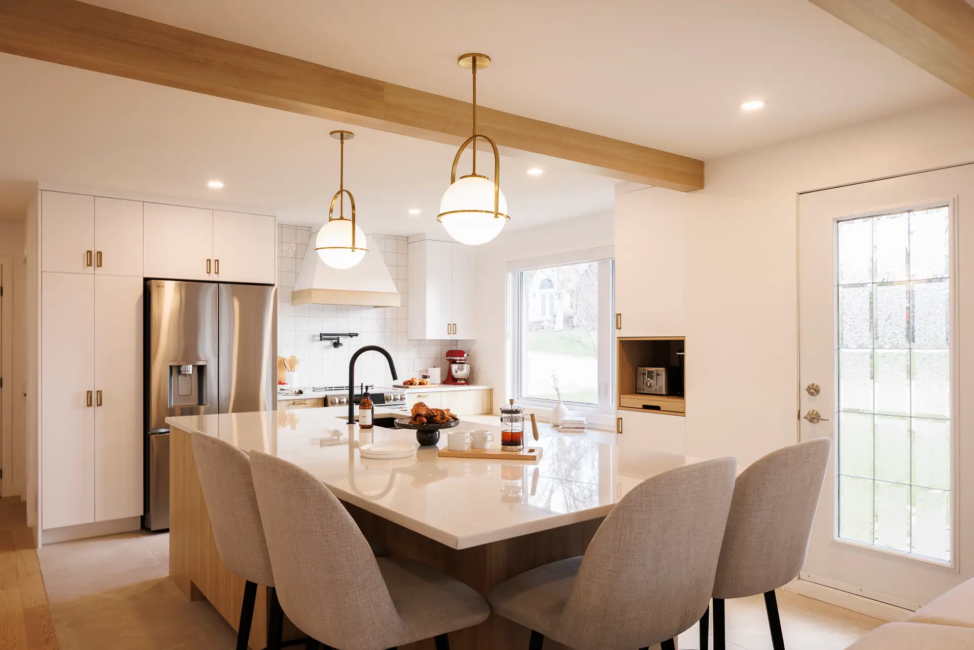
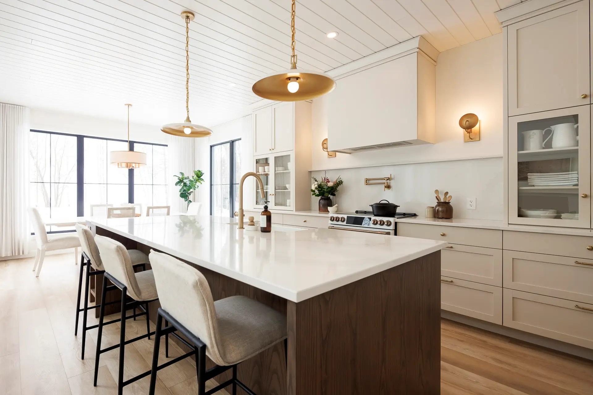
Beige, Cream and Taupe
Kitchen cabinets in warm neutrals brighten the space without overwhelming it. They advantageously replace pure white, especially in north-facing or less sunny rooms. The advantage? More enveloping walls that complement the veining of a stone countertop and the texture of an oak floor.
Pro-Tips
- Material pairing: light quartzite veined with beige, brushed travertine, ivory zellige.
- Hardware/metals: aged brass to warm up the space, brushed nickel for a more discreet look.
- Wall paint: off-white with a creamy undertone, or a light greige to envelop without weighing down.
Beige or taupe kitchen cabinet colours are excellent trendy options to create a soft and timeless ambience.
Mushroom Taupe and Soft Mastic
These nuanced taupes — neither too grey nor too brown — offer the versatility of white with a more curated presence. Ideal for streamlined designs, they enhance matte finishes and handleless door profiles. At ROCHON, we enjoy pairing these shades with softened stone countertops; the overall effect is one of quiet elegance.
These trendy kitchen cabinet colours harmonize perfectly with noble materials and subtle metals.


Earthy Hues — Terracotta, Caramel, Ochre
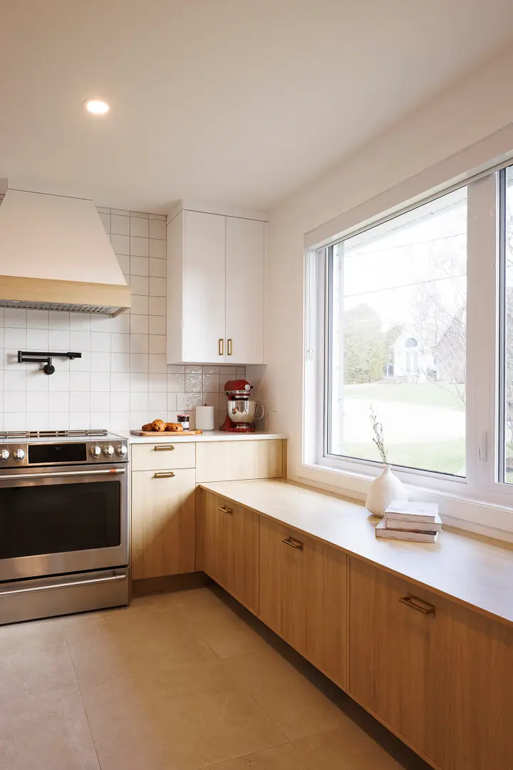
Earthy hues bring grounding and warmth. A powdery terracotta on the island, a tobacco caramel on the base cabinets, or a spicy ochre in open modules create a warm, deep ambience, especially when combined with mineral surfaces.
Pro-Tips
- Material pairing: travertine with honey veining, latte coffee granite, smoked oak.
- Hardware/metals: oiled bronze or burnished brass (stunning with terracotta).
- Wall paint: sandy lime, ecru or clay grey (avoid bluish whites, which cool these tones).
Terracotta kitchen cabinets stand out for their enveloping and artisanal effect, a look in high demand for 2026.
Mossy and Muted Greens — From Sage to Forest Green
A must-have for the past two seasons, muted green kitchen cabinets soothe and connect you with nature. Sage works perfectly for wall-facing cabinets, while forest green lends structure to islands. Designers also mention enveloping olive greens, often combined with warm wood and brass handles.
Pro-Tips
- Material pairing: green Calacatta marble, off-white quartz, soapstone with a soft grain.
- Hardware/metals: aged brass or brushed copper for contrast; matte black if a more defined look is preferred.
- Wall paint: light greige, warm cream or an off-white with a greenish-yellow undertone for a harmonious finish.
Muted mossy greens—trending kitchen cabinet colours in 2025 and 2026—bring calm and pair beautifully with aged-brass finishes.
Deep Teal — A Blue-Green that Defines Structure
Bolder yet remarkably versatile, deep teal injects rhythm: perfect for base modules, a sculptural island, or even as an accent above a hood vent. Paired with open walnut cabinets and a veined stone countertop or backsplash, it creates a rich balance for a contemporary kitchen style.
Pro-Tips
- Material pairing: medium-to-dark walnut, veined pearl quartzite, backsplash featuring blue-grey zellige.
- Hardware/metals: burnished brass for warmth, brushed nickel for a cooler touch.
- Wall paint: misty grey-green or vanilla white.
Warm Wood Tones — The Return of Noble Wood Essences
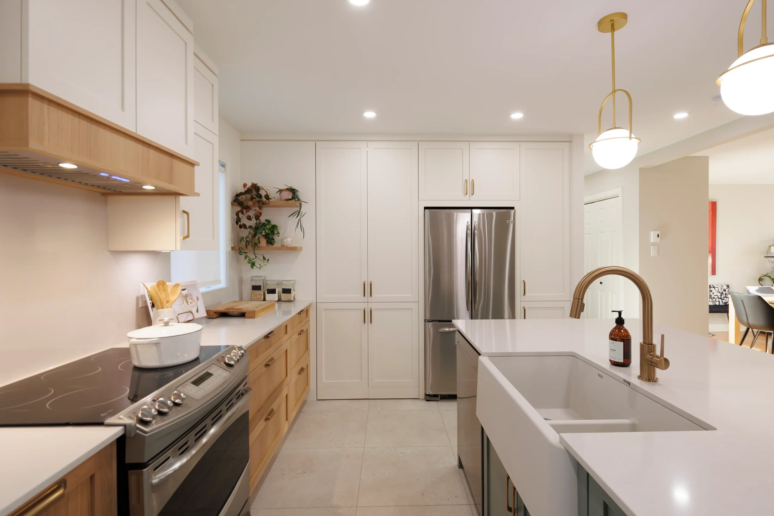
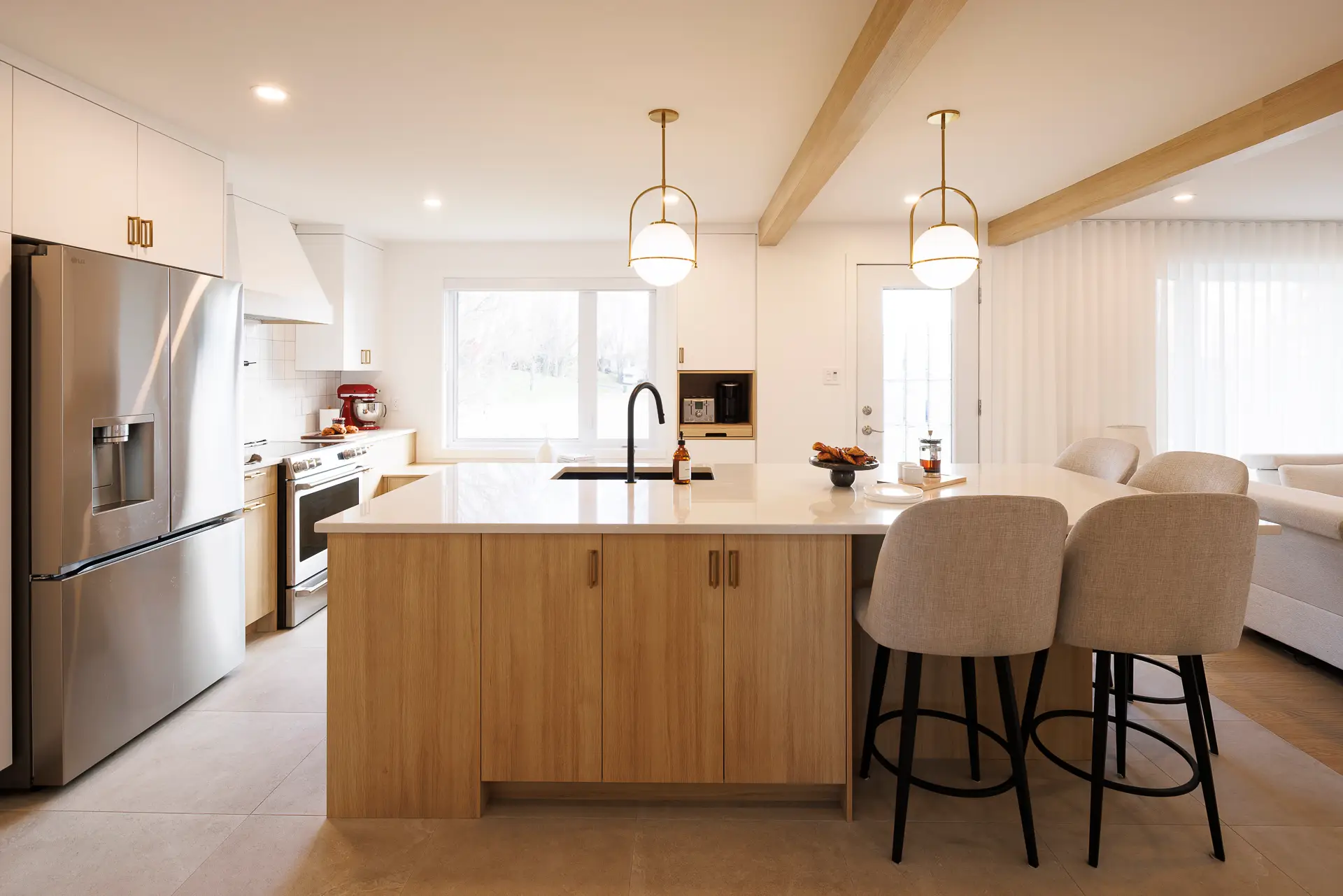
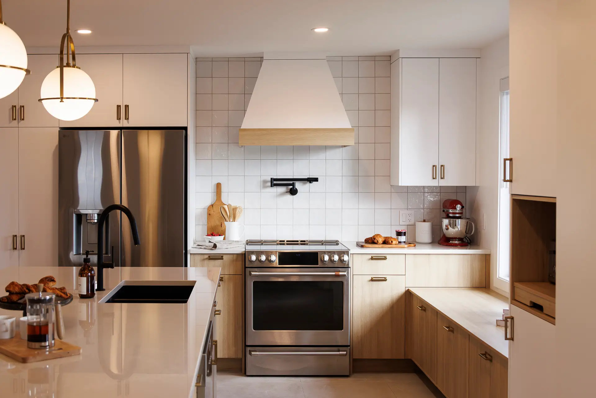
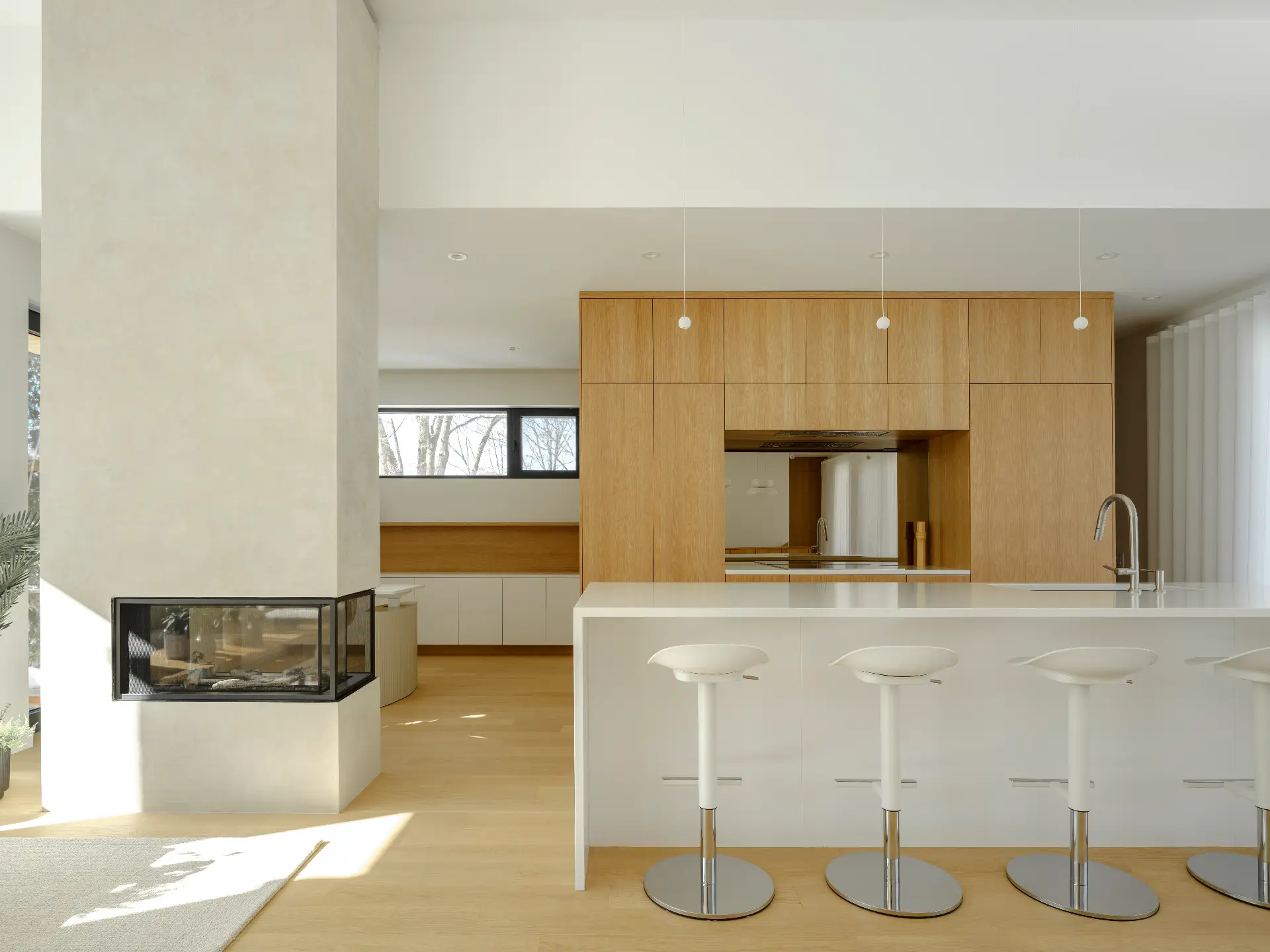
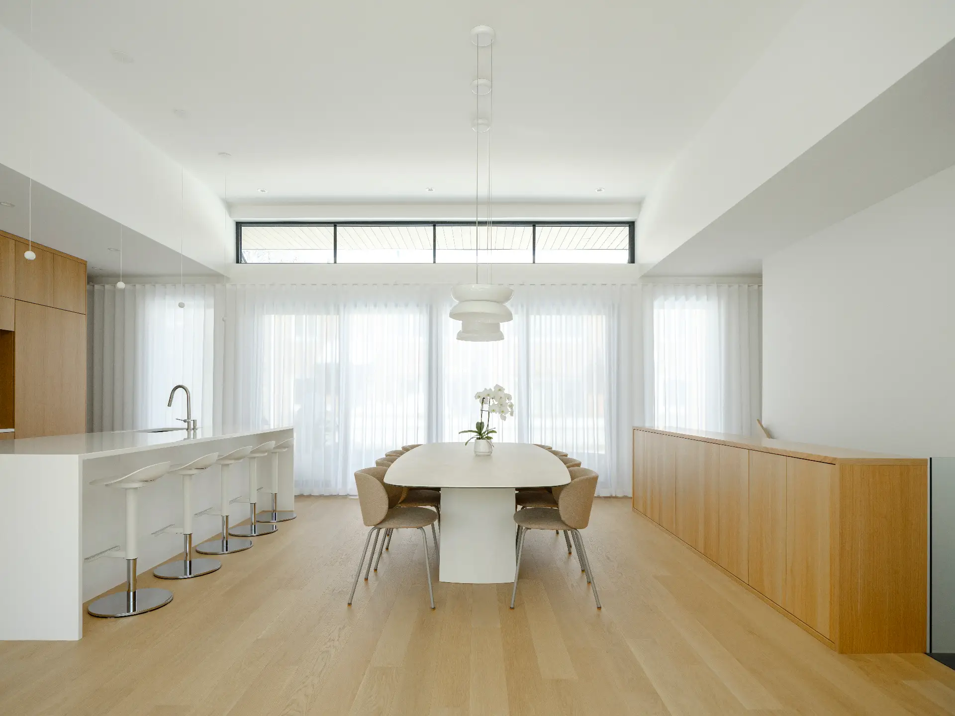
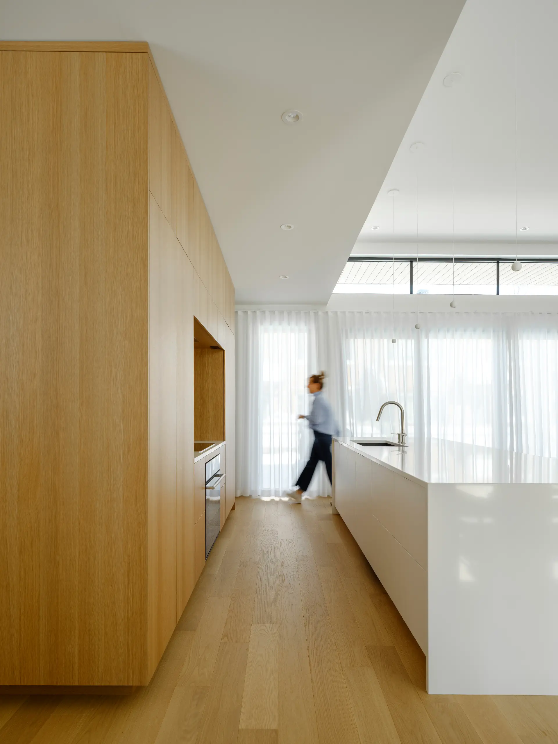
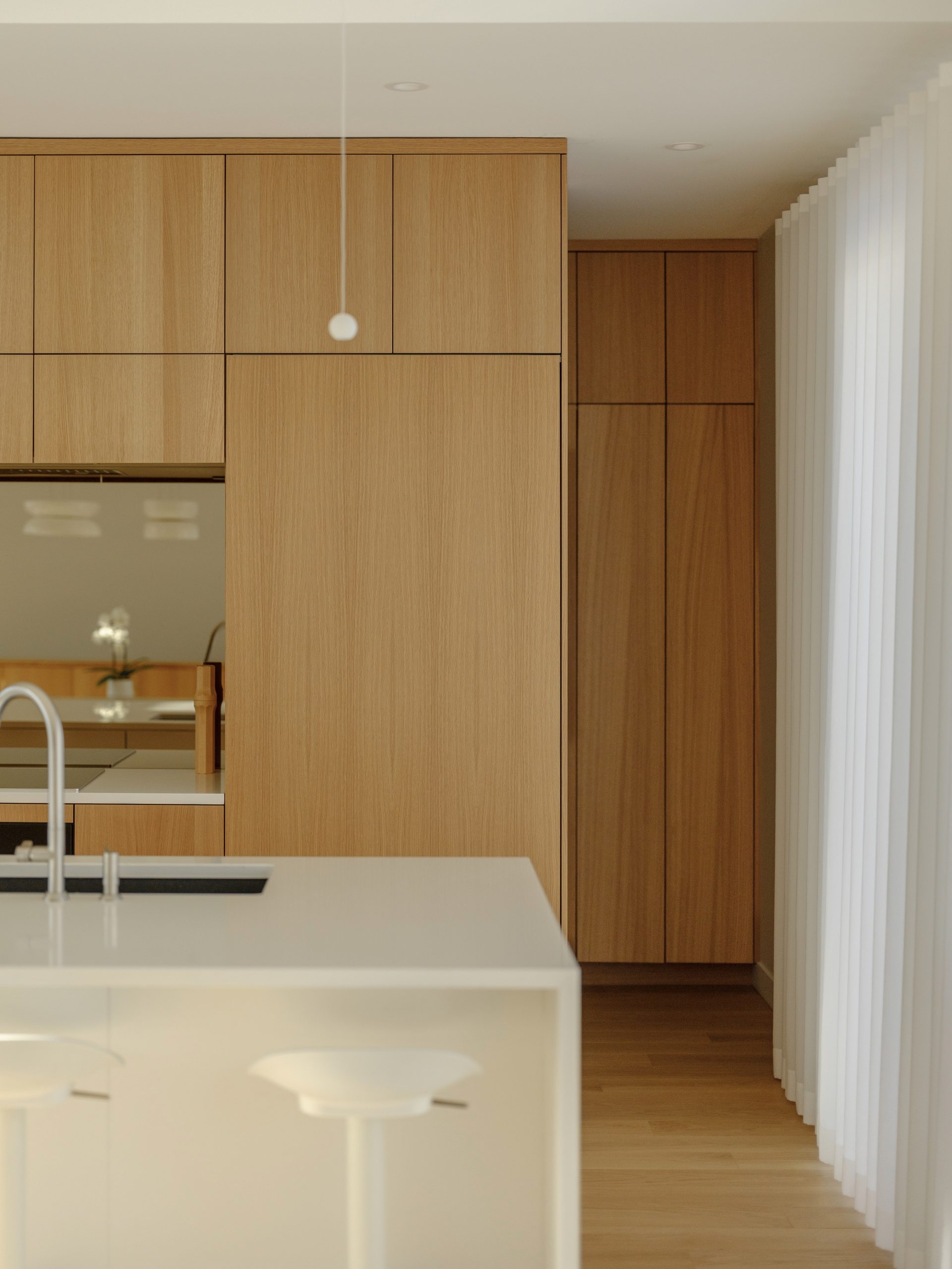
From pale white oak to deep walnut, wood is reclaiming its central role. It appears in base cabinets, panel inserts, or shelving rhythms. Combos of wood + colour (light wood + sage green, dark wood + cream or wood + black) create depth without overwhelming the space.
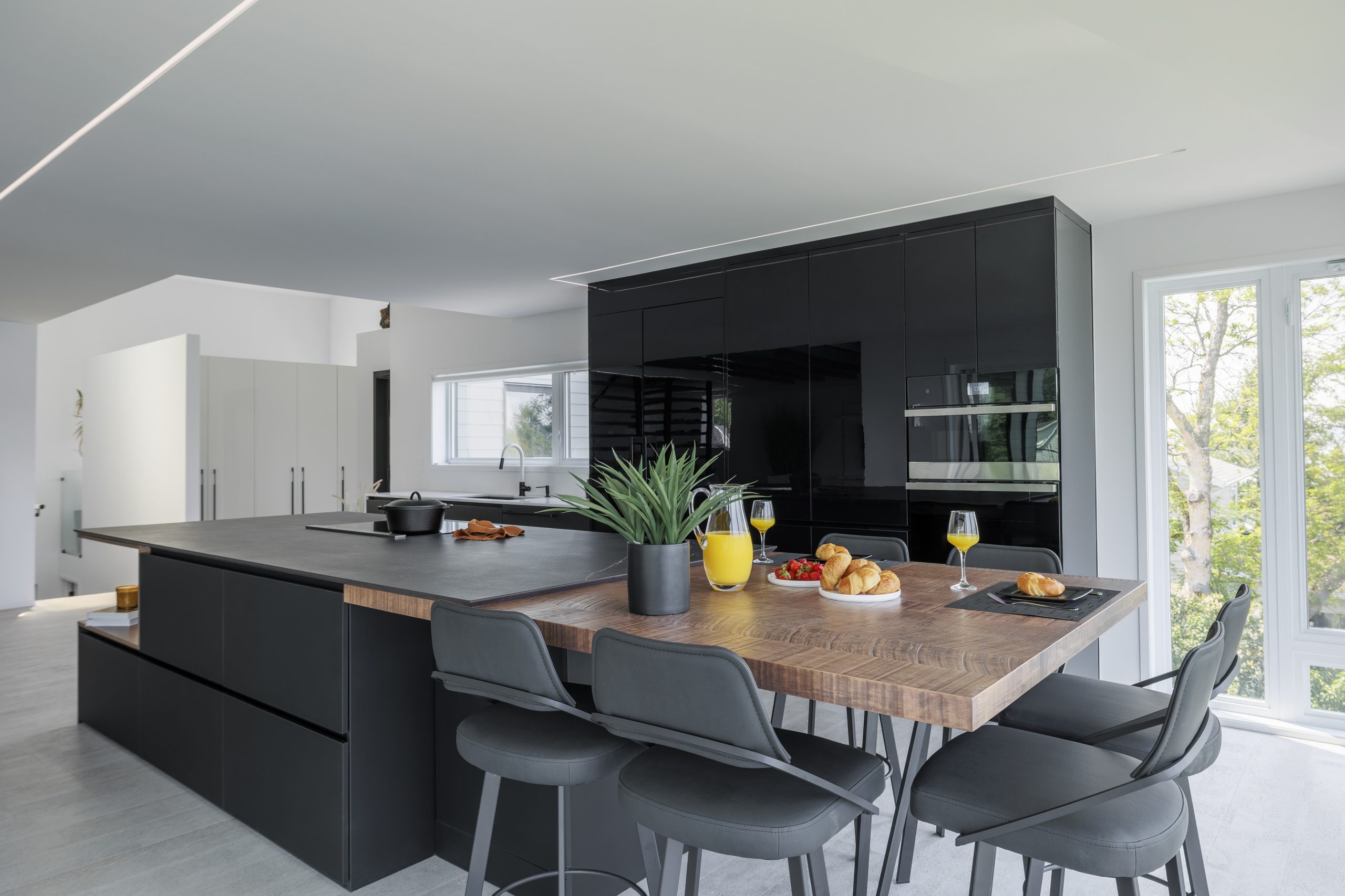
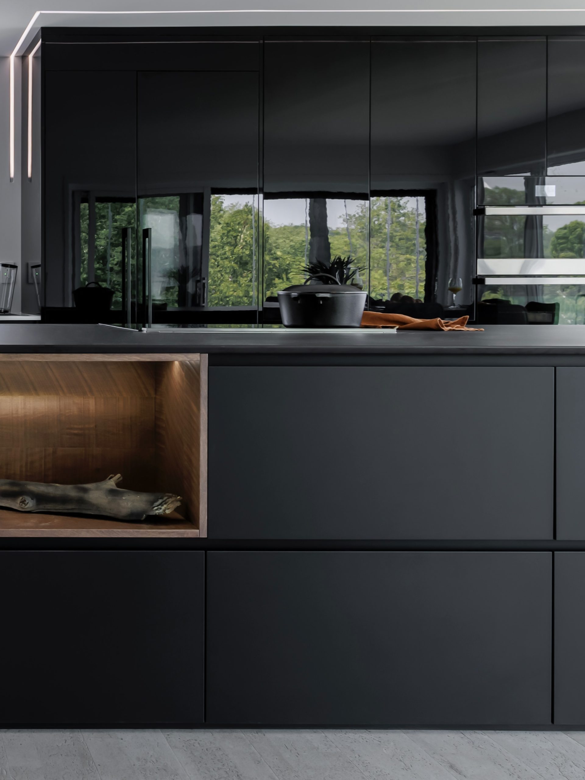
ROCHON white and wood kitchens and black and wood kitchens illustrate the finesse of these combinations and the impact of choosing a matte versus lacquered finish.

Retro Shades — Warm Greys, Deep Burgundy, Rich Blues
The "reimagined retro" style is behind several 2026 trends: warm greys, beet burgundy, ink blues applied to tone-on-tone (cabinets + walls in the same colour family) for a kitchen that is muted, enveloping and never overwhelming. The key is to balance and play with textures (wood, lime, fluted stone) with experienced designers.
Pro-Tips
- Material pairing: milky brown walnut, Arabescato or Bardiglio marble, midnight blue zellige.
- Hardware/metals: polished nickel or chrome for a mid century feel, brass for a warmer style.
- Wall paint: the same hue in a ½ tone on walls (or ceiling) for a cocoon of sophistication.
Choose one of these trendy and daring kitchen cabinet colours for your next custom kitchen.
Crushed Pepper for Accentuation
Just as pepper adds character to every dish, elevate your space with a touch of crushed pepper, Behr's colour of the year. This soft black, akin to charcoal gray, delivers both a dramatic and sophisticated effect.
This tone can bring remarkable depth to a room when used on cabinets and furniture or even on a feature wall to highlight painted elements. For even more impact, opt for a full application of crushed pepper paint, which will make contrasting elements such as light wood furniture, metallic pieces, and other must-haves for your kitchen stand out.
A dark kitchen colour that works equally well for subtle accentuation or a truly dramatic effect.
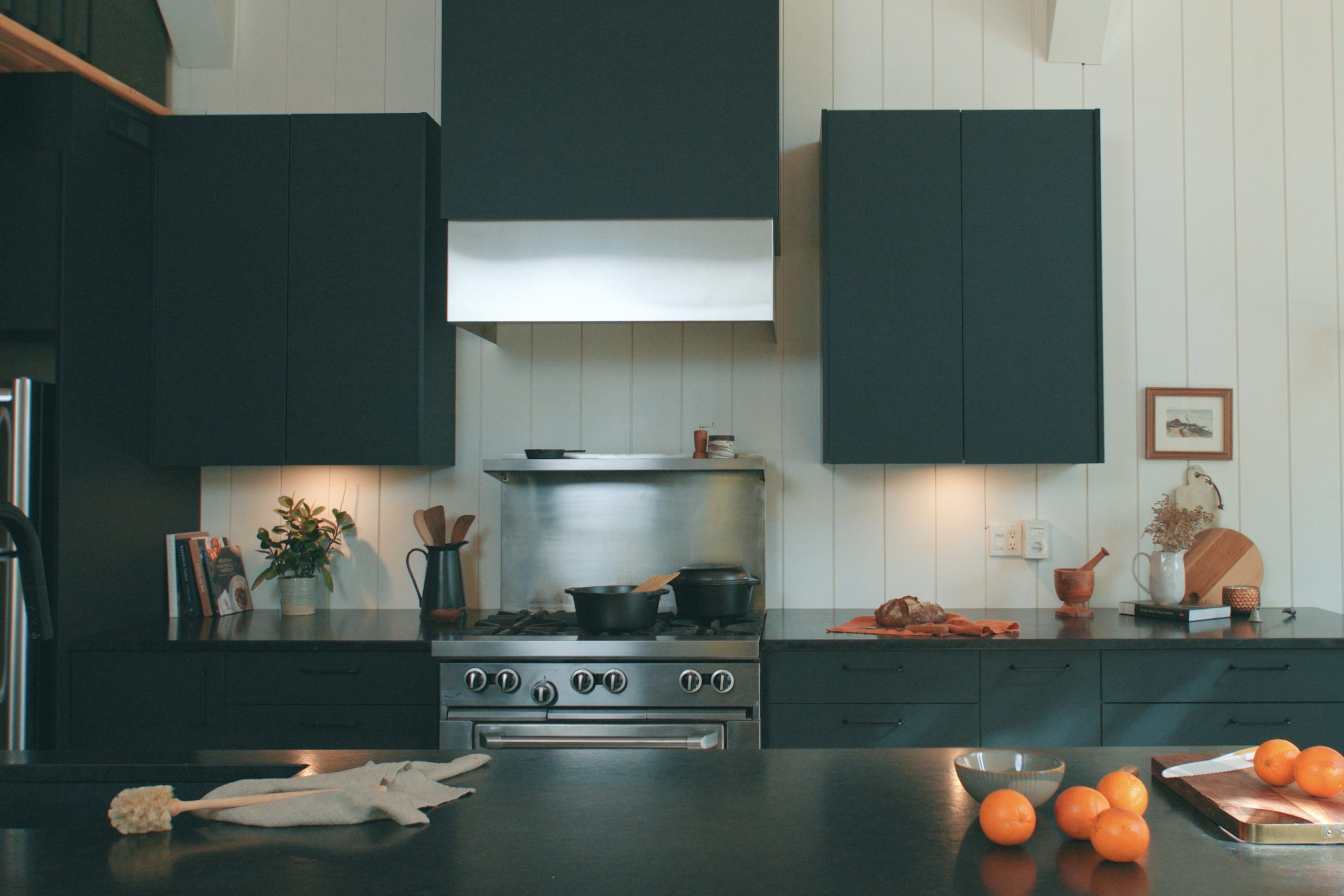
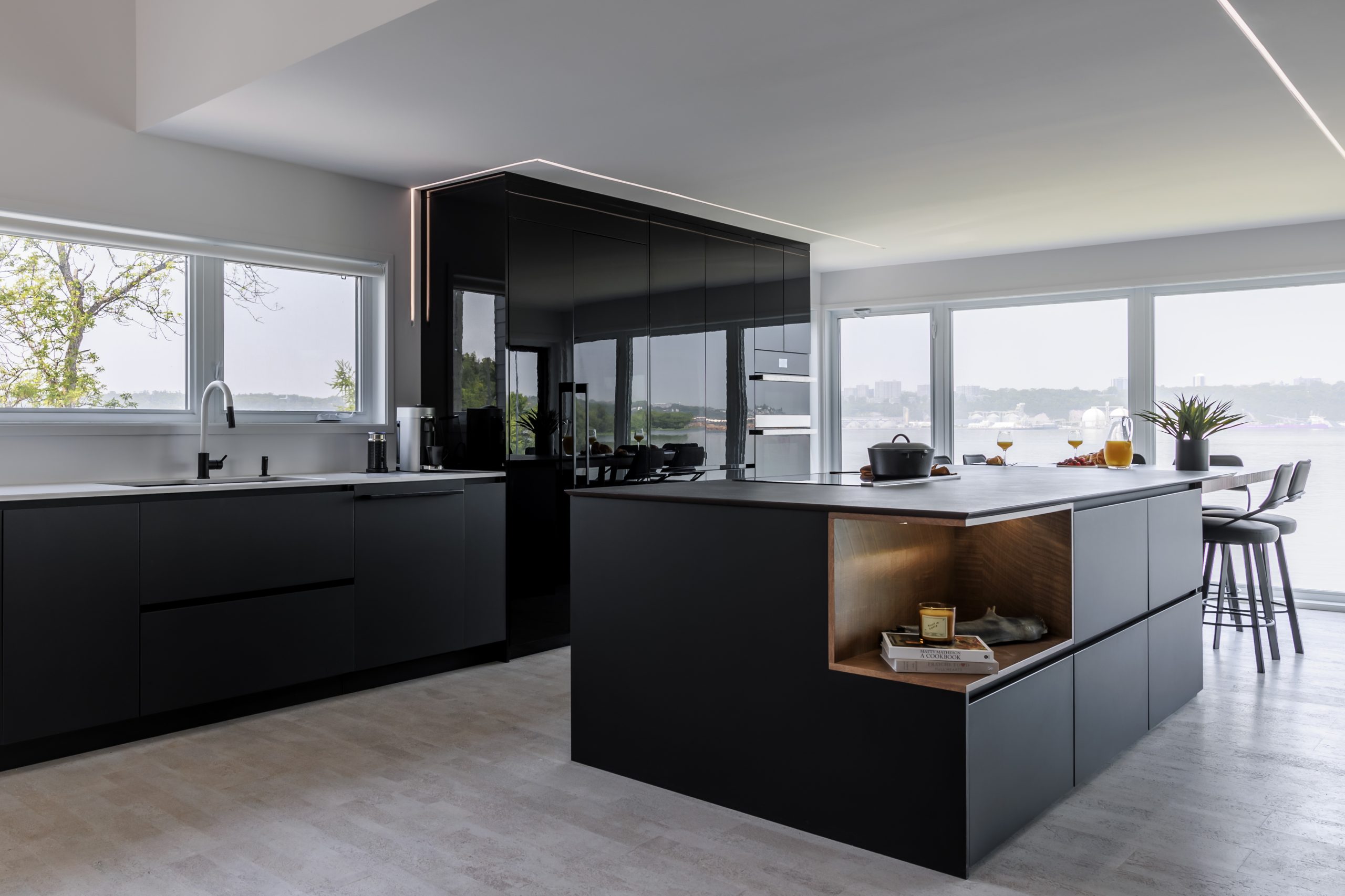
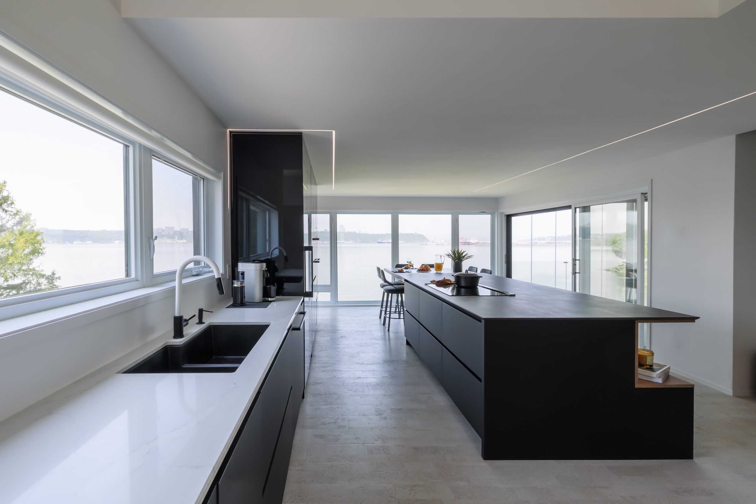
Black Cabinets Remain Popular
Ever trendy, black cabinets offer versatility! Whether you choose modern kitchen colours with dazzling whites, woodwork, a marble countertop or stainless steel, black is a universal option.
Moreover, this kitchen cabinet colour adds a sophisticated and dramatic touch that does not go unnoticed. To quickly elevate your kitchen's style, matte black or wood-effect black will certainly earn compliments from your guests.
Note that glossy finishes have been less in vogue in recent years.
Recommended Wall Colours (To Complement your Cabinets)
- Beige/cream/taupe cabinets → Warm off-white or very light greige walls; aged brass/brushed nickel metals; natural linen textiles.
- Mushroom taupe cabinets → Beige-clay (½ tone) walls; travertine stone; oiled bronze metals.
- Terracotta/caramel/ochre cabinets → Ecru lime or sandy walls; smoked oak; burnished brass metals.
- Sage/forest/olive cabinets → Light greige or warm ivory walls; soapstone or white quartz; brass or matte black metals.
- Deep teal cabinets → Misty gray-green walls; walnut; brushed nickel metals.
- Warm gray/burgundy/ink blue cabinets → Coordinated ½ tone (tone on tone) walls; veined marble; chrome/polished nickel metals.
7 Things to Consider when Choosing a Cabinet Colour
- Light and orientation: In a north-facing kitchen, opt for warm neutrals or honey-toned woods; in south-facing spaces, dare with deeper shades that retain their nuance.
- Adjacent surfaces: Floor, countertop, backsplash; consider the undertones of each surface: yellow, red or gray. A taupe cabinet can take on a rosy tint if the floor has red tones.
- Contrast vs. immersion: Do you want a signature island or a calming monochrome kitchen?
- Texture & finish: Matte for softness and anti-glare; satinet/lacquer for a more formal and luminous look.
- Maintenance & family life: A micro-textured matte finish hides marks better than a mirror lacquer.
- Metals and appliances: Choose one dominant metal (≈ 70%) and a secondary one (≈ 30%) to avoid disharmony.
- Longevity: If you plan to sell in the short-to-medium term, apply the colour to the island or lower cabinets and keep the upper ones lighter or wood-toned.
Painting Your Walls... Sometimes the Best Solution
Before opting for kitchen cabinets in a bold trendy colour, it might be wise to reserve these shades for the walls.
- The walls offer much greater flexibility: they can be repainted easily if you want to refresh the decor or neutralize the ambience. This is a strategic choice, especially if you plan to sell your home in the medium term.
- Cabinets, often considered a heavy and lasting investment, are more appealing to buyers when offered in subtle, timeless or natural hues.
- Choosing colourful walls thus allows you to enjoy current trends without compromising resale value, while creating a warm and personalized atmosphere.
Not sure where to start with your kitchen renovation?
FAQ — Trending Kitchen Cabinet Colours for 2026
1. Which kitchen cabinet colour works best in a small kitchen?
In a small kitchen, it is best to opt for light and luminous hues such as off-white, soft beige or even a slightly warm pearl grey. These tones reflect natural light and give the impression of a larger, airier space. They also create a timeless, neutral background that can be enhanced with accessories or a more colourful accent wall. Even in a compact area, the kitchen cabinet colour can be an aesthetic asset while maintaining a friendly atmosphere.
2. How do you choose a kitchen cabinet colour based on natural light?
Light is key when selecting a tone. If your kitchen benefits from abundant natural light, you can afford to choose bolder, deeper colours, such as forest green or deep teal, that intensify throughout the day.
In contrast, in a darker or north-facing room, it is better to favour a light and warm kitchen cabinet colour, like cream or soft taupe, to compensate for the lack of light and avoid a heavy design.
3. Which materials best harmonize with different kitchen cabinet colours?
Each colour deserves an appropriate setting. For example, taupe or beige cabinets pair beautifully with light wood flooring and a veined white quartz countertop.
Conversely, darker cabinets such as deep blue or matte black find their equilibrium with light mineral surfaces (travertine, quartzite) and brighter walls.
The key is to create a dialogue between the materials so that the cabinet colour integrates into a harmonious and coherent design.
4. Is it advisable to opt for two-tone cabinets?
Yes, two-tone is a strong and sophisticated trend. Combining two colours on your cabinets creates visual rhythm without overwhelming the space.
For example, base cabinets in a dark hue (olive, deep teal, wood) paired with upper cabinets in a lighter tone (beige, cream) add contrast and elegance.
This interplay of colours creates visual depth and helps to subtly structure an open-plan kitchen.
5. What are the most trendy kitchen cabinet colours for 2026?
In 2026, there is a marked return to natural and warm colours. Muted greens (sage, olive, forest), earthy tones (terracotta, caramel, ochre) and sophisticated neutrals (mushroom taupe, beige cream) dominate. Wood, from light oak to dark walnut, also reclaims a central role.
Furthermore, bolder shades such as deep teal or even certain burgundies punctuate high-end kitchen projects. Every trending kitchen cabinet colour is paired with matte finishes that reinforce a natural, organic look.
6. How does the ambience of a kitchen change with the cabinet colour?
Colour wields significant emotional power. Cabinets in sage or beige create a soft and soothing ambience, ideal for a family kitchen. Deep blue or burgundy add sophistication and a touch of theatricality.
Conversely, natural wood brings warmth and authenticity, perfect for a warm, timeless atmosphere. By carefully choosing your kitchen cabinet colour, you define not only the style and personality of the space, but also the overall energy of the room.
7. What mistakes should be avoided when choosing a kitchen cabinet colour?
The first mistake is neglecting light: a colour that looks stunning on a swatch may appear dull in your kitchen.
The second error is using too many bold colours without coherence, which can cause visual fatigue and disrupt the overall balance.
Finally, failing to test full-size samples is a common oversight. Always apply test panels in the room and observe them at different times of day before making your final decision.
8. How can you refresh your kitchen cabinets without replacing them?
If your cabinets are still in good condition, several options exist to give them a new lease on life.
Specialty cabinet paint is a durable solution that allows you to adopt a new kitchen cabinet colour at a low cost.
High-quality adhesive films also offer a quick and reversible alternative, especially if you rent your home.
Finally, replacing the hardware with trendy handles (aged brass, matte black, brushed nickel) can transform your kitchen's aesthetic without extensive renovations.